Design is not just about how something looks, but how it works. For a beginner, the path from a “nice picture” to a functional interface lies through understanding the basics and constant practice. Mastery in this field requires a delicate balance between aesthetic intuition and technical precision. By diving deep into user psychology and grid systems, you transform static layouts into interactive experiences. Remember, every successful product starts with a simple sketch, but it is the iterative process of testing and refining that leads to a truly seamless user journey.
“Design is not what you see, but what you make others see.” — Edgar Degas
Function Over Form: Always ask yourself: “What problem does this element solve?”. If it is only for aesthetics, consider removing it.
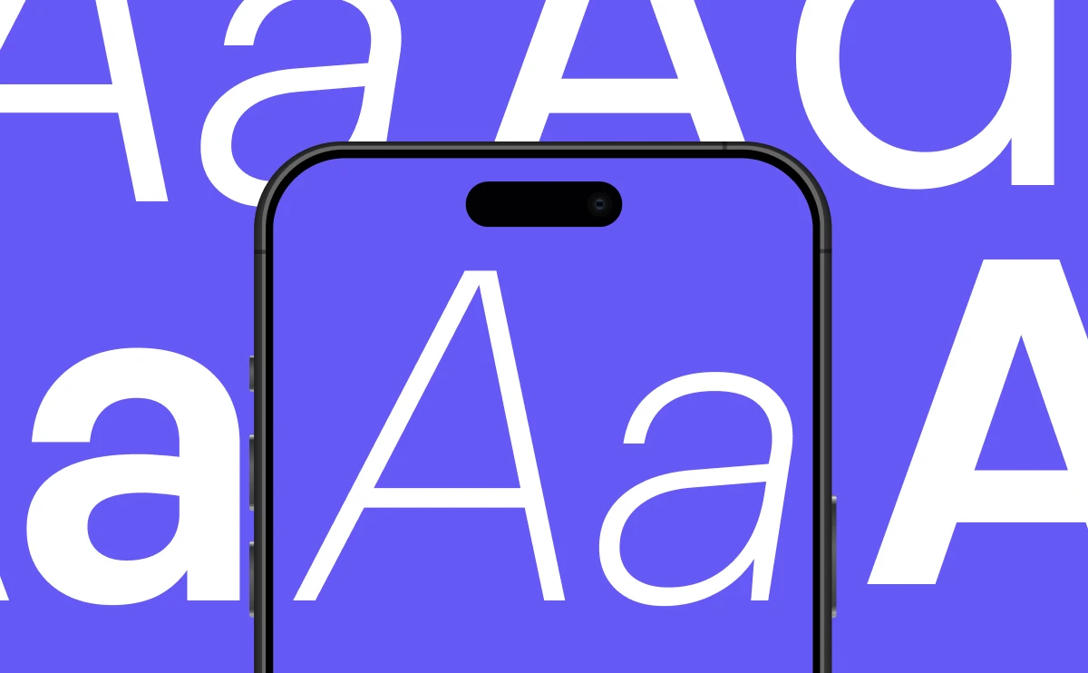
Typography is 95% of Design: Learn to work with font hierarchy. Use modern sans-serifs, like Plus Jakarta Sans, for accents and clean fonts for body text.
Master “Negative Space”: Do not fear emptiness. It allows the content to breathe and guides the user’s eye.
The 60-30-10 Rule: Use 60% of a dominant neutral color, 30% for a secondary color, and 10% for accents like buttons or links.
Before opening any design tool, master these core principles that separate professionals from amateurs:
2. Quality Check-list for Your Projects
Every professional layout should pass these checks:
Consistency: Do all buttons have the same border radius and spacing?
Grid System: Are elements aligned to a standard grid (e.g., a 12-column grid)?
Master “Negative Space”: Do not fear emptiness. It allows the content to breathe and guides the user’s eye.
Responsiveness: How will this block rearrange itself on a mobile screen?
3. Technical Tutorial: Creating a Modern Content Card
A card is a fundamental building block of any website. Here is how to make it look professional:
Container: Add a subtle border or a soft shadow. Avoid heavy, dark shadows.
Heading: Use a Semi-bold weight to create a clear visual center.
Spacing (White Space): Do not push text to the edges. Leave at least 24-32px of internal padding.
Border Radius: Use soft corners (8px, 12px, or 16px) to make the interface feel more friendly.
4. Utilizing Freebies & Resources
Using ready-made resources is about efficiency, not laziness.
Icon Sets: Look for vector sets (SVG) in the Figma Community to ensure they stay sharp on all screens.
Fonts: Use Google Fonts or Uncut.wtf to find high-quality, free-to-use typefaces.
Images: Use high-quality stock photos from sites like Unsplash or Pexels.
Do not fear technical hurdles. If you encounter errors (like “Error Code 5”), treat them as part of the learning process. Understanding how design translates into real code will make you a much more valuable specialist in the market.
“Design is not just what it looks like and feels like. Design is how it works.” — Steve Jobs
About S. Rogers
Adipiscing adipiscing parturient nascetur ullamcorper interdum vivamus iaculis elementum lectus feugiat duis egestas facilisi morbi sed massa nascetur parturient vel per vestibulum est.Vel lacus habitant habitasse.