

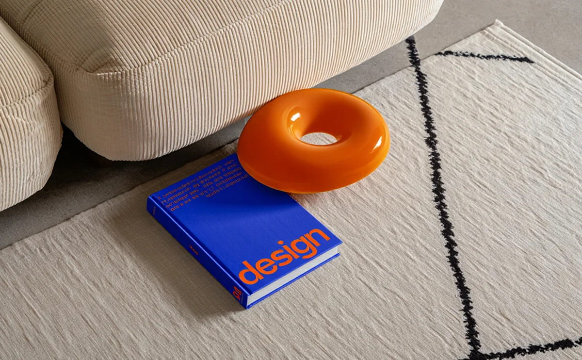
Colors set the tone for your entire home, and modern decor thrives on a refined palette. In 2026, think soft earth tones paired with muted neutrals, accented by bold pops of color like deep terracotta or forest green. This article dives into trending shades, how to use them in different rooms, and the perfect decor items from our collection that bring these tones to life.
Meet the 2026 Palette
This year’s palette is calm, grounded and a little bit bold. Instead of chasing every trend, pick one neutral base, one earthy mid-tone and one confident accent, and let them repeat through the room.
Earth Tones and Soft Neutrals
The foundation of the 2026 look is warm and natural.
- Terracotta and clay: rich, sun-baked reds that add warmth to walls, ceramics and textiles.
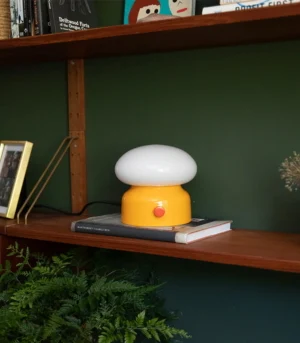
- Forest green and olive: deep, leafy shades that pair beautifully with cream, oak and brass.
The 60-30-10 Formula
A reliable way to balance colour is to divide the room into three parts.
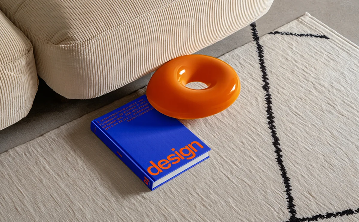
- 60% base: walls, large furniture and flooring in soft neutrals like oat, sand or warm white.
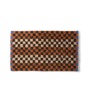
- 30% secondary: curtains, rugs and upholstery in your earthy mid-tone.
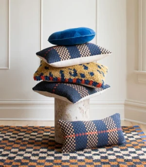
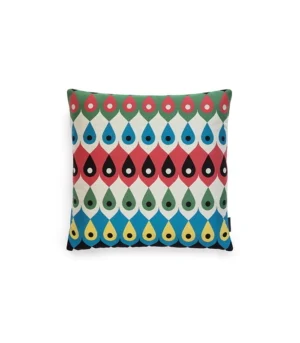
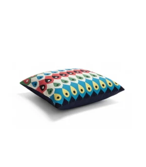
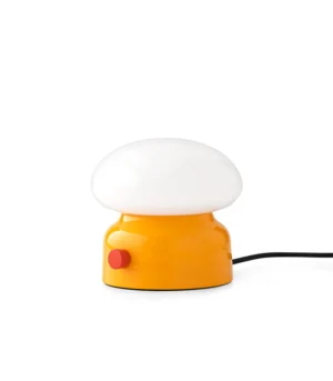
- 10% accent: pillows, lamps and small objects in your boldest shade.
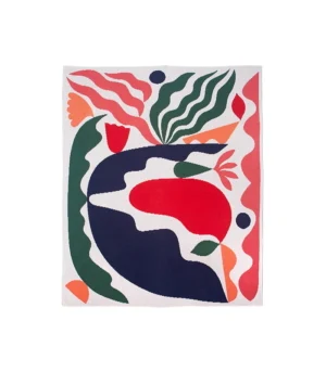
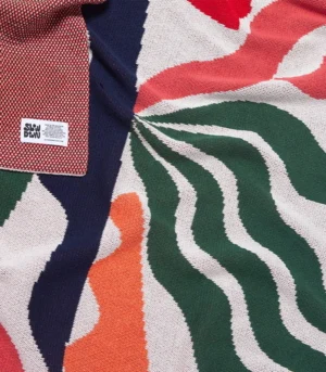
Colour Room by Room
The same palette works everywhere, but the proportions change with the room’s job.
- Living room: keep sofas neutral and layer colour through textiles that are easy to swap.
- Bedroom: choose softer, desaturated versions of your shades to support sleep.
- Kitchen and dining: bring in bolder tones through tableware and small accessories.
Test Before You Commit
Paint a large swatch and look at it at different times of day. Natural light changes colour dramatically, and a shade you love at noon can feel very different by evening.
Ready to refresh your home? Start with one new colour and build from there. Shop our collection in this year’s best tones!